TabbedPanels provide tabs to select between different screens.
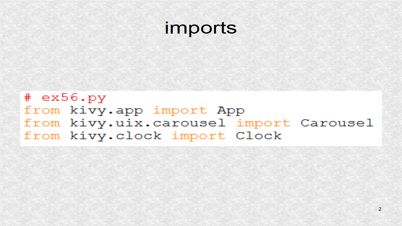
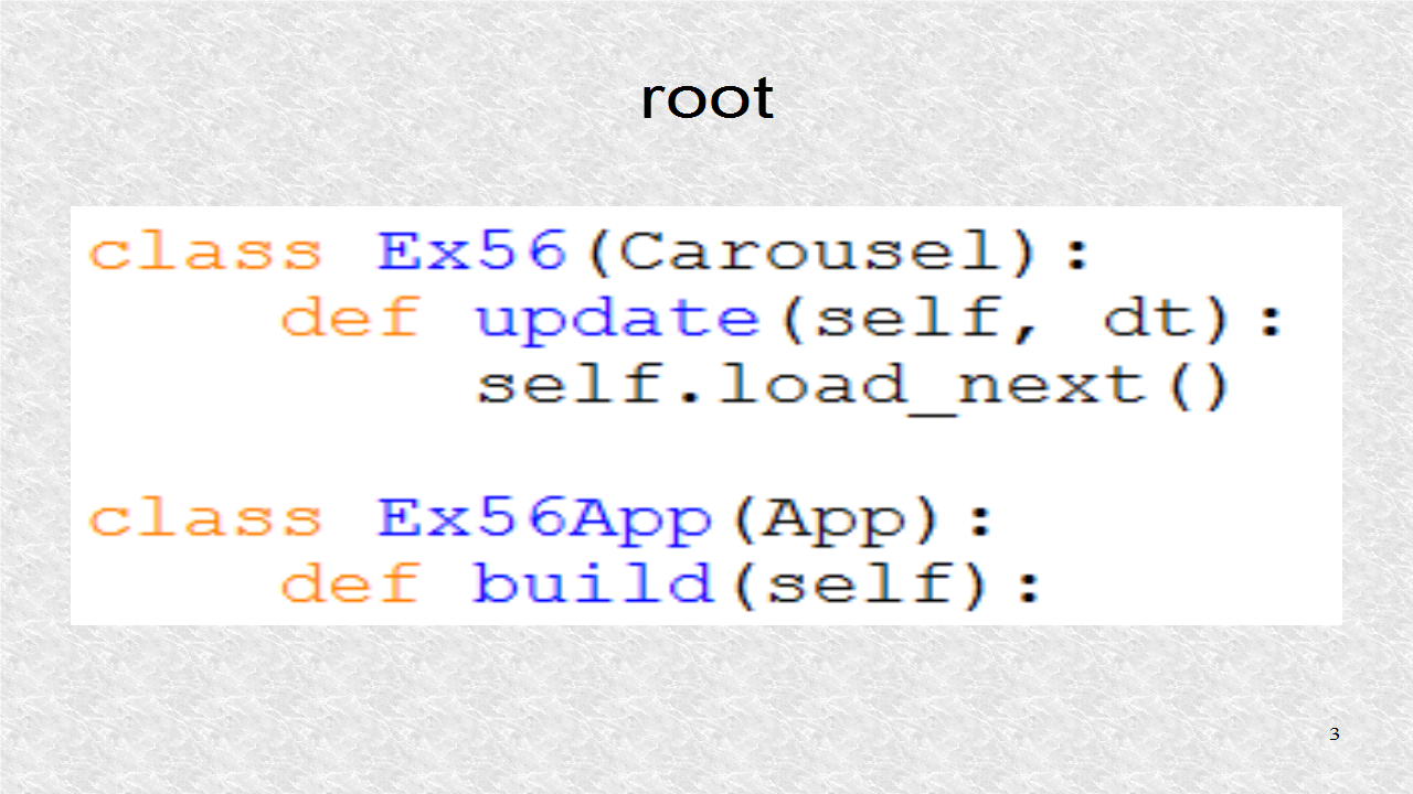
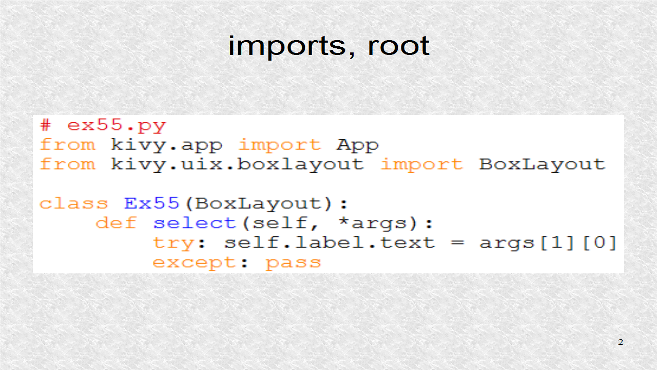
The TabbedPanel widget is used for the root. The App class is needed for any application.
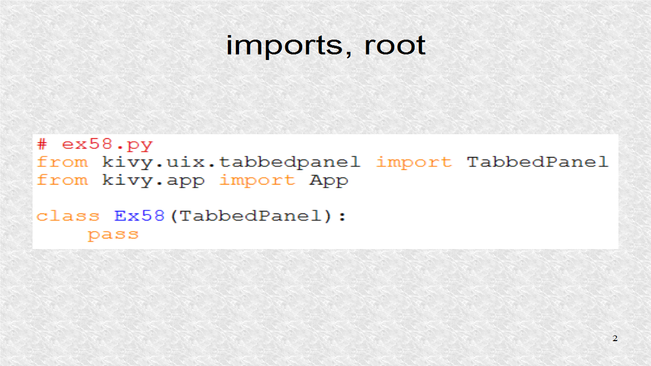
We have to have a subclass of the App class.
# ex58.py
from kivy.uix.tabbedpanel import TabbedPanel
from kivy.app import App
class Ex58(TabbedPanel):
pass
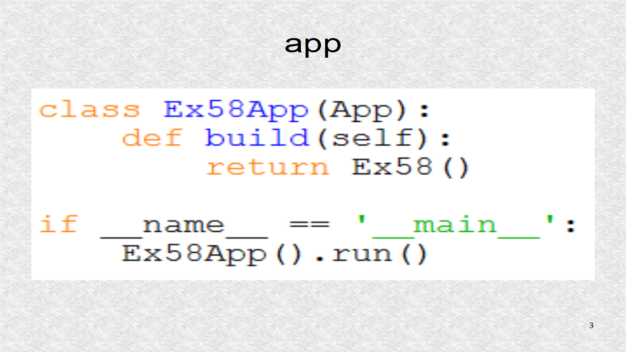
class Ex58App(App):
def build(self):
return Ex58()
if __name__ == '__main__':
Ex58App().run()
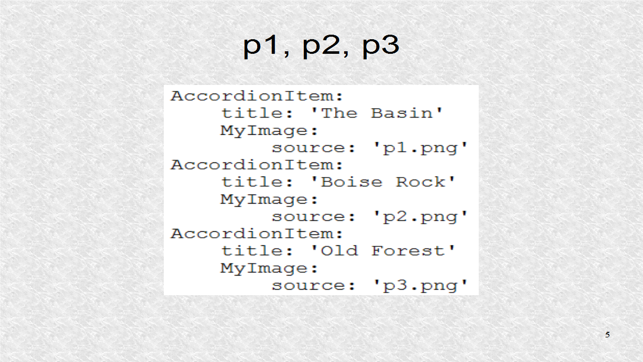
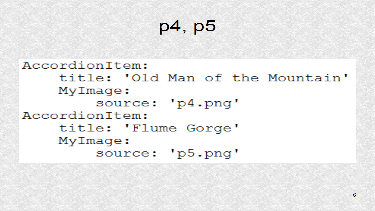
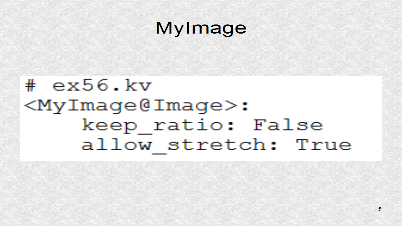
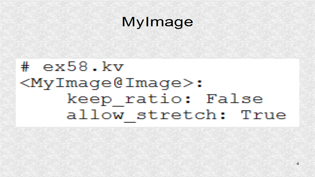
In the kv file, the MyImage dynamic class is created and it allows for a stretchable image.
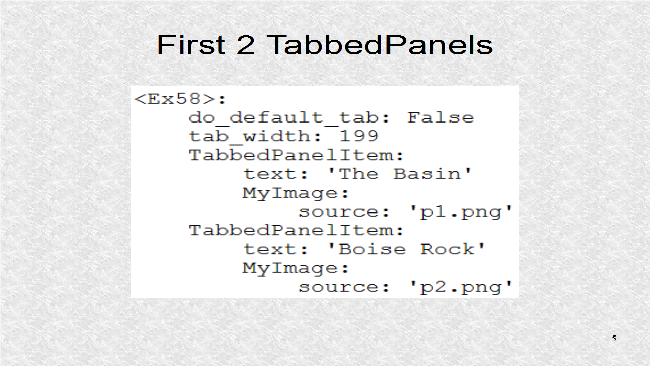
The first 2 screens are of the images p1 and p2. There will only be tabs for the Panels and their width is 199 pixels.
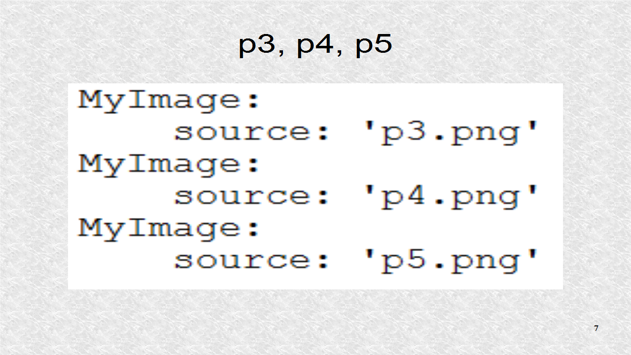
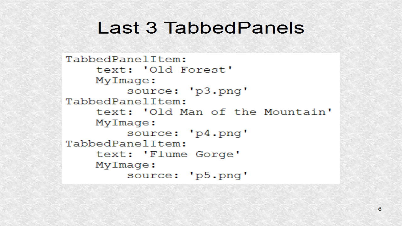
The next 3 screens corresponds to images p3, p4 and p5.
# ex58.kv
<MyImage@Image>:
    keep_ratio: False
    allow_stretch: True

<Ex58>:
    do_default_tab: False
    tab_width: 199
    TabbedPanelItem:
        text: 'The Basin'
        MyImage:
            source: 'p1.png'
    TabbedPanelItem:
        text: 'Boise Rock'
        MyImage:
            source: 'p2.png'
    TabbedPanelItem:
        text: 'Old Forest'
        MyImage:
            source: 'p3.png'
    TabbedPanelItem:
        text: 'Old Man of the Mountain'
        MyImage:
            source: 'p4.png'
    TabbedPanelItem:
        text: 'Flume Gorge'
        MyImage:
            source: 'p5.png'
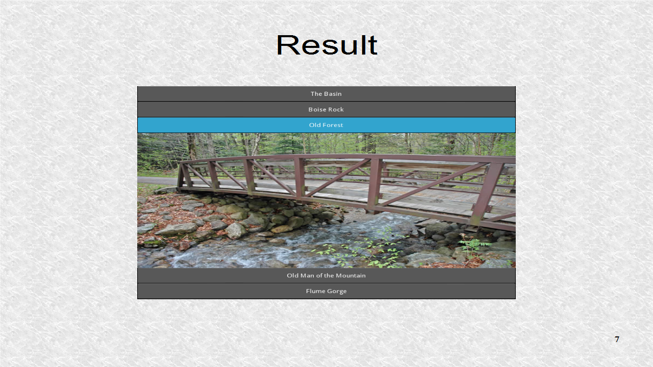
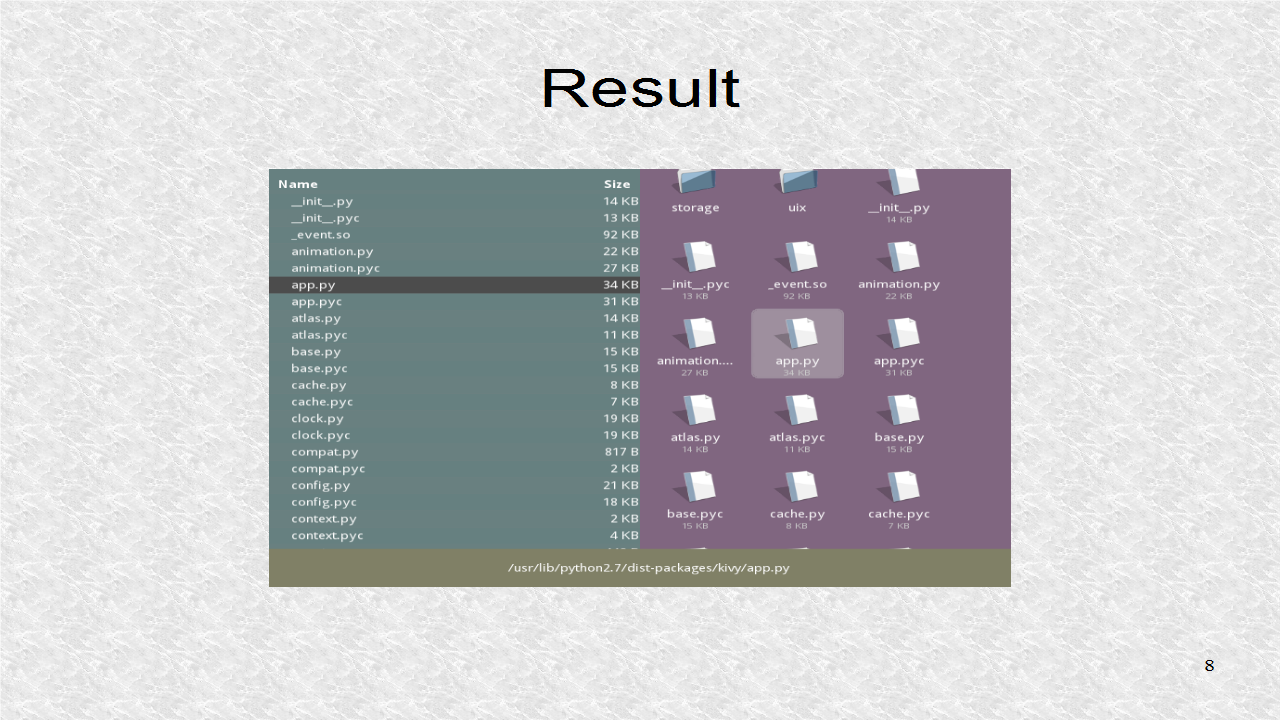
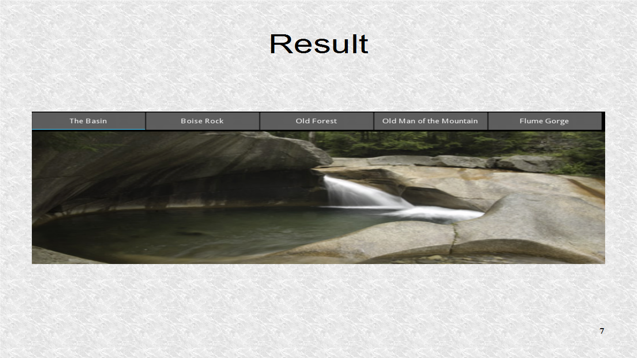
In this result, we select the p1 image. The window was resized to show all tabs. For the mobile, you will have to make calculations about the tab size so they all fit in a fixed-size screen.