Saturday, May 31, 2014

10. Multiple kv Files

Most applications will use many kv files.


This is the Python program, which uses GridLayout as the root widget. In addition to the main kv file, it loads box1.kv, box2.kv and box3.kv. There are also 2 application variables. These variables are referenced from the main kv file.


# ex10.py

from kivy.uix.gridlayout import GridLayout
from kivy.app import App
from kivy.lang import Builder

Builder.load_file('box1.kv')
Builder.load_file('box2.kv')
Builder.load_file('box3.kv')

class Ex10(GridLayout):
    pass
   
class Ex10App(App):
    def build(self):
        self.x=150
        self.y=400
        return Ex10()

if __name__=='__main__':
    Ex10App().run()


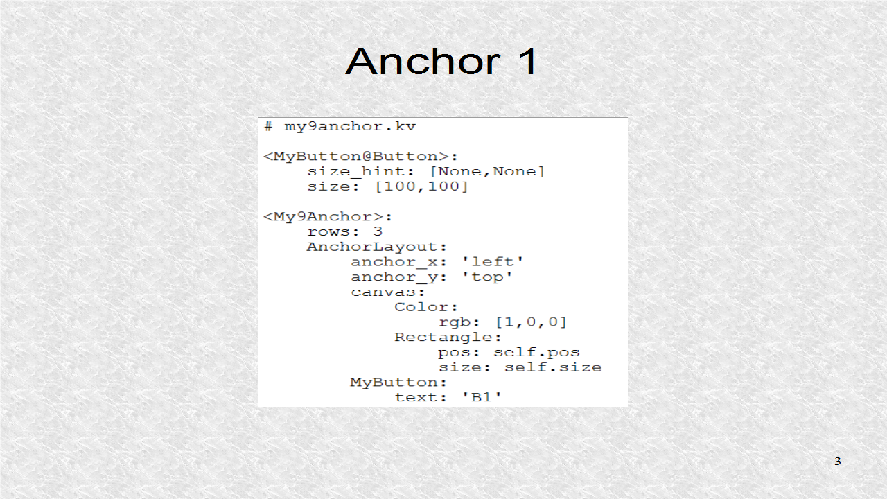
The main kv file is a GridLayout with 3 columns. The 3 columns will contain different AnchorLayouts. The first AnchorLayout is shown here. It is colored red, and has Box1 as a child, and which is anchored, at center-left.


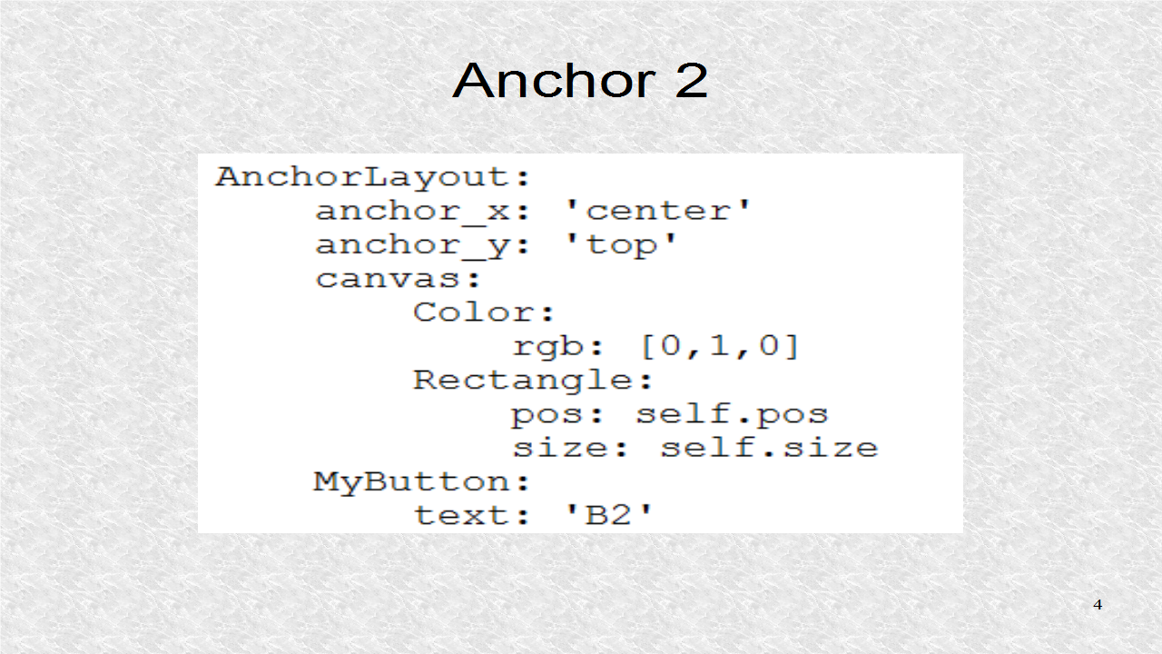
The second AnchorLayout is shown here. It is colored green, and has Box2 as a child, which will be anchored at center-center.


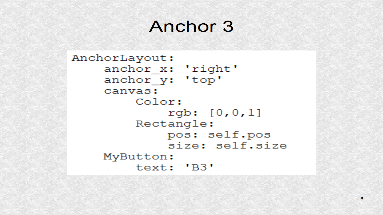
The third AnchorLayout is shown here. It is colored blue, and has Box3 as a child, which will be anchored at center-right.


# ex10.kv

<Ex10>:
    cols: 3
    AnchorLayout:
        anchor_x: 'left'
        anchor_y: 'center'
        canvas:
            Color:
                rgb: [1,0,0]
            Rectangle:
                pos: self.pos
                size: self.size
        Box1:
            size_hint: [None,None]
            size: [app.x,app.y]
    AnchorLayout:
        anchor_x: 'center'
        anchor_y: 'center'
        canvas:
            Color:
                rgb: [0,1,0]
            Rectangle:
                pos: self.pos
                size: self.size
        Box2:
            size_hint: [None,None]
            size: [app.x,app.y]
    AnchorLayout:
        anchor_x: 'right'
        anchor_y: 'center'
        canvas:
            Color:
                rgb: [0,0,1]
            Rectangle:
                pos: self.pos
                size: self.size
        Box3:
            size_hint: [None,None]
            size: [app.x,app.y]           


This is the kv file, defining Box1 as 2 buttons with text of 'B1a', and 'B1b'.


<Box1@BoxLayout>:
    Button:
        text: 'B1a'
    Button:
        text: 'B1b'


This is the kv file, defining Box2 as 2 buttons with text of 'B2a', and 'B2b'.


<Box2@BoxLayout>:
    Button:
        text: 'B2a'
    Button:
        text: 'B2b'


This is the kv file, defining Box3 as 2 buttons with text of 'B3a', and 'B3b'.


<Box3@BoxLayout>:
    Button:
        text: 'B3a'
    Button:
        text: 'B3b'


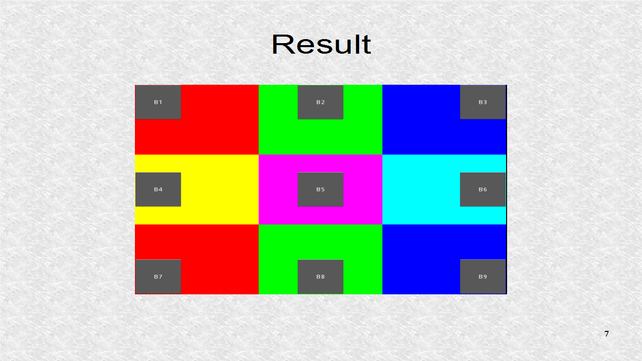
This is the result, with the different colors representing the 3 different AnchorLayouts. Each has two buttons, as defined by box1.kv, box2.kv and box3.kv.


Friday, May 30, 2014

9. AnchorLayout

In AnchorLayout, we can anchor a child to 9 different positions. These 9 positions include the 4 corners, the 4 points corresponding to the middle of edge lines, as well as the center the layout.


This is the Python program that will load the AnchorLayouts. Here, we use a GridLayout as our root widget class. The GridLayout, will be the parent of 9 AnchorLayouts. The 9 AnchorLayouts will be anchored at the 9 different anchoring positions.


# my9anchor.py

from kivy.uix.gridlayout import GridLayout
from kivy.app import App

class My9Anchor(GridLayout):
    pass
   
class My9AnchorApp(App):
    def build(self):
        return My9Anchor()

if __name__=='__main__':
    My9AnchorApp().run()


First a class, MyButton, is created. MyButton is based on Button, but is a Button of size 100 by 100. To give a size, the size_hint has to be None for x and y. Then, a grid with rows equal to 3 is created. Since, there are a total of 9 AnchorLayout children, a matrix of 3 by 3 is created. The first AnchorLayout, anchors the button at top-left side. The button has the text 'B1'. The AnchorLayout is colored red.


The second AnchorLayout has the buttons anchored at the top-center, with a button text of 'B2'. The layout is of color green.


AnchorLayout 3 has the button anchored at the top-right. It has the text 'B3'. The AnchorLayout is colored blue.


Next the other AnchorLayouts are defined. For AnchorLayout 4, the button is anchored at center-left, that is y is selected as center, and x is selected as left. The others are center-center, center-right, bottom-left, bottom-center, and bottom-right. The colors in the last row are the same as in the first row.


# my9anchor.kv

<MyButton@Button>:
    size_hint: [None,None]
    size: [100,100]

<My9Anchor>:
    rows: 3
    AnchorLayout:
        anchor_x: 'left'
        anchor_y: 'top'
        canvas:
            Color:
                rgb: [1,0,0]
            Rectangle:
                pos: self.pos
                size: self.size
        MyButton:
            text: 'B1'
    AnchorLayout:
        anchor_x: 'center'
        anchor_y: 'top'
        canvas:
            Color:
                rgb: [0,1,0]
            Rectangle:
                pos: self.pos
                size: self.size
        MyButton:
            text: 'B2'
    AnchorLayout:
        anchor_x: 'right'
        anchor_y: 'top'
        canvas:
            Color:
                rgb: [0,0,1]
            Rectangle:
                pos: self.pos
                size: self.size
        MyButton:
            text: 'B3'
    AnchorLayout:
        anchor_x: 'left'
        anchor_y: 'center'
        canvas:
            Color:
                rgb: [1,1,0]
            Rectangle:
                pos: self.pos
                size: self.size
        MyButton:
            text: 'B4'
    AnchorLayout:
        anchor_x: 'center'
        anchor_y: 'center'
        canvas:
            Color:
                rgb: [1,0,1]
            Rectangle:
                pos: self.pos
                size: self.size
        MyButton:
            text: 'B5'
    AnchorLayout:
        anchor_x: 'right'
        anchor_y: 'center'
        canvas:
            Color:
                rgb: [0,1,1]
            Rectangle:
                pos: self.pos
                size: self.size
        MyButton:
            text: 'B6'
    AnchorLayout:
        anchor_x: 'left'
        anchor_y: 'bottom'
        canvas:
            Color:
                rgb: [1,0,0]
            Rectangle:
                pos: self.pos
                size: self.size
        MyButton:
            text: 'B7'
    AnchorLayout:
        anchor_x: 'center'
        anchor_y: 'bottom'
        canvas:
            Color:
                rgb: [0,1,0]
            Rectangle:
                pos: self.pos
                size: self.size
        MyButton:
            text: 'B8'
    AnchorLayout:
        anchor_x: 'right'
        anchor_y: 'bottom'
        canvas:
            Color:
                rgb: [0,0,1]
            Rectangle:
                pos: self.pos
                size: self.size
        MyButton:
            text: 'B9'      


This is the result. This was not a very realistic example, since the child does not have to be a widget. It could be another Layout, which could have many widgets. Thus by combination of layouts, we can create a complex widget design. As you can see, the kv file will become large. However, we can split the kv file, as we will see later.


Wednesday, May 28, 2014

8. GridLayout

GridLayout lays out the widgets as a matrix.


It is similar to the StackLayout orientation of left-to-right, and top-to-bottom. Either, we set rows, or cols, which stands for columns, and the layout knows that, this number is, the maximum number of widgets, in a given row or column, depending on which parameter is given.


In this kv file, we set cols to be 3. There are nine buttons, and since, none have an explicit size_hint, all will be the same size, and a matrix of 3 by 3 is created.


The main Python file is shown. It imports the gridlayout module as the alias TheGrid. This is not the standard way of doing things in Kivy, as now to access the class GridLayout, we have to write TheGrid.GridLayout. This is a confusing way of doing things and not recommended.


# mygrid.py

import kivy.uix.gridlayout as TheGrid
from kivy.app import App

class MyGrid(TheGrid.GridLayout):
    pass
   
class MyGridApp(App):
    def build(self):
        return MyGrid()

if __name__=='__main__':
    MyGridApp().run()


This is the result, showing the buttons in a 3 by 3 matrix. We can also, put rows at 3, in the Kivy file, and the result will be the same.


Each widget in GridLayout has a size_hint of 1,1 . Thus, to change the width and height, we have to give a scaling factor.


In this kv file, only the Button 'B3' has an explicit size_hint, which is 2,2. Thus, this Buttons is twice the width and height as the other buttons. This is only true, in reference to buttons, not in the row or column of the widget, with the new scaling. All widgets in the same row, will get the same height, and all widgets in the same column will get the same width.


# mygrid.kv

<MyGrid>:
    cols: 3
    spacing: 20
    padding: [20,10]
    Button:
        text: 'B1'
    Button:
        text: 'B2'
    Button:
        text: 'B3'
        size_hint: [2,2]
    Button:
        text: 'B4'
    Button:
        text: 'B5'
    Button:
        text: 'B6'
    Button:
        text: 'B7'
    Button:
        text: 'B8'
    Button:
        text: 'B9'


In this result, we can see that even though, we explicitly only changed B3, we can see how it also effects the row and column, which is scaled.


Tuesday, May 27, 2014

7. Background Color

To add a background color to a Layout, you have to use canvas.


canvas refers to graphic instructions. The instructions could be non-visual such as setting a color and transformations, and are called context instructions. The other group of instructions involve actual objects like points and lines, and are called vertex instructions. All widgets can have a canvas.


# ex7.py

from kivy.uix.stacklayout import StackLayout
from kivy.app import App

class MyStack(StackLayout):
    pass
   
class Ex7App(App):
    def build(self):
        return MyStack()

if __name__=='__main__':
    Ex7App().run()


First the color is set, giving a rgb value. Then, a filled rectangle is drawn, covering the entire Layout. This will form the background color.


In the kv file, a new rule is created. A new class is created called My Button and it inherits the properties of Button. The only value it changes is the color. Now, all buttons will have that color, for the text, provided that all references to Button are changed to My Button.


In the kv file, there are a total of 5 buttons. All of them are changed to My Button. There are also 2 Widgets which only act as placeholders of specific size. Note, here the 'B3' button is given a width of 100 pixels. The rule is that size_hint has to have a None in the x-value, if with width is fixed. This is because size_hint has precedence.


# ex7.kv

<MyButton@Button>:
    color: [0, 1, 1, 1]
    
<MyStack>:
    orientation: 'bt-rl'
    spacing: 20
    padding: [20,10]
    canvas:
        Color:
            rgb: [.5, .5, .95]
        Rectangle:
            pos: self.pos
            size: self.size
    MyButton:
        text: 'B1'
        size_hint: [.3,.4]
    MyButton:
        text: 'B2'
        size_hint: [.3,.4]
    Widget:
        size_hint: [None, .2]
        width: 100
    MyButton:
        text: 'B3'
        size_hint: [None,.4]
        width: 100
    Widget:
        size_hint: [None,.2]
        width: 100
    MyButton:
        text: 'B4'
        size_hint: [.3, .4]
    MyButton:
        text: 'B5'
        size_hint: [.3, .4]                   


This shows the result. There are empty spaces, which are occupied by the Widgets. If we did not add a Widget, after button B2, in the kv file, then the button will start at y of 0. However this particular Widget adds a relative y-spacing of 20%.


6. StackLayout

StackLayout can organize widgets with more complexity than BoxLayout.


BoxLayout organizes widgets either horizontally or vertically. With StackLayout, you can combine the orientations. There are 4 row-wise orientations, and there are 4 column-wise orientations. The four row-wise orientations, are shown in the next few examples, along with one example, of a column-wise orientation.


This is the main Python file, which will call a particular kv file. As in the BoxLayout examples, we don't have a main kv file.


# mystack.py

from kivy.uix.stacklayout import StackLayout
from kivy.lang import Builder
from kivy.app import App

Builder.load_file('mystack_bt_lr.kv')

class MyStack(StackLayout):
    pass
   
class MyStackApp(App):
    def build(self):
        return MyStack()

if __name__=='__main__':
    MyStackApp().run()


All kv files are of this format. There are a total of 9 Buttons, each with the same size_hint so three will fit in a column, and three will fit in a row.


# mystack_lr-tb.kv

<MyStack>:
  orientation: 'lr-tb'
  Button:
    text: 'B1'
    size_hint: [.33,.33]
  Button:
    text: 'B2'
    size_hint: [.33,.33]
  Button:
    text: 'B3'
    size_hint: [.33,.33]
  Button:
    text: 'B4'
    size_hint: [.33, .33]
  Button:
    text: 'B5'
    size_hint: [.33, .33]
  Button:
    text: 'B6'
    size_hint: [.33, .33]
  Button:
    text: 'B7'
    size_hint: [.33,.33]
  Button:
    text: 'B8'
    size_hint: [.33,.33]
  Button:
    text: 'B9'
    size_hint: [.33,.33]


This is the result for the orientation 'lr-tb'. The Buttons are added in left-to-right fashion, and secondly from top-to-bottom.


This is for the orientation 'lr-bt'. First the widgets are added left-to-right and then bottom-to-top.


This is for the orientation 'rl-bt'. First the widgets are added right-to-left and then bottom-to-top.


This is for the orientation 'rl-tb'. First the widgets are added right-to-left and then top-to-bottom.


So far, the examples were row-wise orientations. Now, there is an example of a column-wise orientation, such that bottom-to-top is first, and left-to-right is next. However instead of Button with text 'B5', we have a Widget. The Widget Class is the class that all widgets, such as Buttons, are based on.


# mystack_bt_lr.kv

<MyStack>:
  orientation: 'bt-lr'
  Button:
    text: 'B1'
    size_hint: [.33,.33]
  Button:
    text: 'B2'
    size_hint: [.33,.33]
  Button:
    text: 'B3'
    size_hint: [.33,.33]
  Button:
    text: 'B4'
    size_hint: [.33, .33]
  Widget:
    size_hint: [.33, .33]
  Button:
    text: 'B6'
    size_hint: [.33, .33]
  Button:
    text: 'B7'
    size_hint: [.33,.33]
  Button:
    text: 'B8'
    size_hint: [.33,.33]
  Button:
    text: 'B9'
    size_hint: [.33,.33]


Because of the Widget, B5 is replaced by an empty box.


Monday, May 26, 2014

5. BoxLayout

In the previous examples, BoxLayout has been used. Now, we will go over it, in a more detailed fashion.


These are the files in a folder. There is a Python file and 5 Kivy language files. However, only one kv file will be called, by the Python file, at a time.


This is the main Python file, which will call a particular kv file, using the load_file function, of the Builder class. Note, we don't have a main kv file as it is not needed.


# helloworld.py

from kivy.uix.boxlayout import BoxLayout
from kivy.lang import Builder
from kivy.app import App

Builder.load_file('helloworld_1.kv')

class MyBox(BoxLayout):
    pass
   
class HelloWorldApp(App):
    def build(self):
        return MyBox()

if __name__=='__main__':
    HelloWorldApp().run()


This is the first kv file, and it is similar to that in the previous example. However, the orientation, now, is vertical.


# helloworld_1.kv

<MyBox>:
  orientation: 'vertical'
  Button:
    text: 'B1'
    on_press: print('--> B1')
  Button:
    text: 'B2'
    on_press: print('--> B2')
  Button:
    text: 'B3'
    on_press: print('--> B3')


It results in 3 buttons arranged vertically, taking the entire space of the layout. Since we didn't specify otherwise, each button is the same size.


In the second kv file, spacing is added. This means, that there is a spacing of 50 pixels between the buttons.


# helloworld_2.kv (spacing)

<MyBox>:
    orientation: 'vertical'
    spacing: 50
    Button:
        text: 'B1'
        on_press: print('--> B1')
    Button:
        text: 'B2'
        on_press: print('--> B2')
    Button:
        text: 'B3'
        on_press: print('--> B3')


This shows the result of loading the second kv file. For relative comparison, the size of the app window, which is also the layout size in this case, is 800 by 600.


Padding adds margins between the layout and its child widgets. Padding is a Python List of 4 elements, referring to the left, top, right, and bottom margins. If Padding is given only 1 value, all margins are the same. If Padding is given only 2 values, the top and bottom are the same as well as the left and right. We see that left margin is the smallest value, in this kv file, and the bottom is the greatest.


# helloworld_3.kv (spacing,padding)

<MyBox>:
    orientation: 'vertical'
    spacing: 50
    padding: [20,40,60,80]
    Button:
        text: 'B1'
        on_press: print('--> B1')
    Button:
        text: 'B2'
        on_press: print('--> B2')
    Button:
        text: 'B3'
        on_press: print('--> B3')


This result confirms that the margins have been correctly added.


Now the spacing and padding are removed, to see how pos_hint and size_hint work. size_hint is a Python List of 2 values corresponding to x and y and is only a relative scale. Button3 has an x-value that is twice the other buttons so it is twice the width as the other buttons. For the y, button2 has a y-value that is twice the other buttons so it is twice the height as the others. pos_hint is a Python Dictionary, of x- and y-values. However in vertical BoxLayout orientation, only the x element can be used. The x-value can refer to the leftmost point of widget, 'x', center point of widget, 'center-x', or rightmost point of widget, 'right'. The number are relative to the layout size, from 0 to 1.


# helloworld_4.kv 
# pos_hint, size_hint

<MyBox>:
    orientation: 'vertical'
    Button:
        text: 'B1'
        on_press: print('--> B1')
        pos_hint: {'x' : .1}
        size_hint: [.2,1]
    Button:
        text: 'B2'
        on_press: print('--> B2')
        pos_hint: {'center_x' : .3}
        size_hint: [.2,2]
    Button:
        text: 'B3'
        on_press: print('--> B3')
        pos_hint: {'right': 1}
        size_hint: [.4,1]


For the particular kv file, we get this result with some annotations added. For button 1, we set 'x' at .1 (10%). For button 2, we set 'center_x' at .3 (30%). For button 3, we set 'right' at 1 (100%).


This Kivy file uses the same values as before except spacing and padding are added.


# helloworld_5.kv (spacing,padding)
# pos_hint, size_hint

<MyBox>:
    orientation: 'vertical'
    spacing: 50
    padding: [20,40,60,80]
    Button:
        text: 'B1'
        on_press: print('--> B1')
        pos_hint: {'x' : .1}
        size_hint: [.2,1]
    Button:
        text: 'B2'
        on_press: print('--> B2')
        pos_hint: {'center_x' : .3}
        size_hint: [.2,2]
    Button:
        text: 'B3'
        on_press: print('--> B3')
        pos_hint: {'right': 1}
        size_hint: [.4,1]


Now we can see the margins are added, and there is spacing between the widgets. There are other properties in the BoxLayout, but these form the foundation, and will give the results you want, most of the time.