Monday, June 30, 2014

40. ColorPicker

The ColorPicker widget is used, here, to select a color. This color will be the color for all future drawing widgets, until a new color is selected.


The ColorPicker takes a lot of visual space, thus it is used as a dialog in this tutorial. Thus, we import the Popup class. In a future tutorial, we will use the ScreenManager class to set a new Screen for the ColorPicker. We will need the Widget class for the drawings as well as for the root. The ColorPicker will be embedded in the Popup. Besides the App class, we need the ListProperty, which will be used to hold color information. ColorPicker returns a list of 4 numbers, red, green, blue and alpha. We also define a global variable col. This will be the initial color.


We create a class to hold the drawing widget, which is circle shaped. We save the color information for each circle widget so they can be independent. The ColorPicker and Popup classes are also defined.


This is the root class. Notice this also has a ListProperty. Once the ColorPicker chooses a color, it will be stored here. In the next slide, we will see it being used when a new drawing widget is created. We have a function to open the popup. This function will be called from the kv file when a button is pressed. Next, in on_touch_down, the touch position is tested for the case that it is in the button region. In the kv file, we will define the button as 100 by 100 pixels, at position of 0,0. Should it be inside the button, we let other widgets handle it.


Should it be outside the button, a circle is drawn. After creating a new instance of SelectedColorEllipse, its color list is set to the root's color. After setting the position, it is added to root.


The app class always must exist for any Application.


# ex40.py

from kivy.uix.popup import Popup
from kivy.uix.widget import Widget
from kivy.uix.colorpicker import ColorPicker
from kivy.app import App
from kivy.properties import ListProperty
col = [0,0,1,1]

class SelectedColorEllipse(Widget):
    selected_color = ListProperty(col)

class ColPckr(ColorPicker):
    pass

class ColPopup(Popup):
    pass
    
class Ex40(Widget):
    selected_color = ListProperty(col)
    def select_ColPckr(self,*args):
        ColPopup().open()
    def on_touch_down(self, touch):
        if touch.x <100 and touch.y < 100:
            return super(Ex40, self).on_touch_down(touch)
        sce = SelectedColorEllipse()
        sce.selected_color = self.selected_color
        sce.center = touch.pos
        self.add_widget(sce)
          
class Ex40App(App):
    def build(self):
        return Ex40()

if __name__=='__main__':
    Ex40App().run()


These define the shape of the circle widgets that will be drawn. They get color based on the value of the class's ListProperty.


The Popup window will have a title of 'Color Select'. It is 400 by 400 pixels. It's auto_dismiss is set to False, so a click outside it, will not dismiss it.


Next we embed a ColorPicker into the Popup. It's on_color is called whenever a new color is chosen by a user. If so, the root's ListProperty is changed. In the ColorPicker, we have a 'Select' button which will dismiss the popup.


For the root, we set a background color of white.


In the root, there is a button, which when clicked will open the popup. The button is 100 by 100 and is positioned at 0,0.


# ex40.kv

<SelectedColorEllipse>:
    size: 25,25
    canvas:
        Color:
            rgba: self.selected_color
        Ellipse:
            size: self.size
            pos: self.pos

<ColPopup>:
    title: 'Color Select'
    size_hint: None, None
    size: 400,400
    auto_dismiss: False
    ColPckr:
        on_color: app.root.selected_color = self.color
        Button:
            text: 'Select'
            pos_hint: {'center_x': .76, 'y': .03}
            size_hint: None, None
            size: 100, 50
            on_press: root.dismiss()
        
        
<Ex40>:
    size: root.size
    canvas:
        Color:
            rgb: 1,1,1
        Rectangle:
            size: self.size
            pos: self.pos
    Button:
        size_hint: None, None
        size: 100,100
        pos: 0,0
        text: 'Color Select'
        on_press: root.select_ColPckr(*args)


This result is taken after we have drawn a few circles, and then selected the ColorPicker. The drawing can be seen even though it is slightly greyed out, which indicates a popup is open. Here, we select the cyan color.


After dismissing the popup, we draw an H in the lower middle of the screen.


Sunday, June 29, 2014

39. DragBehavior

Any widget can get DragBehavior. That means it can be dragged around. We can, of course, write code to on_touch_down, and on_touch_move, to simulate same behavior. However, using the DragBehavior class, reduces code, and thus error in typing.


To use DragBehavior, it must be imported from kivy.uix.behaviors module. We update a StringProperty to indicate current state; that is, whether we are dragging or not.


A horse-shaped widget inherits DragBehavior. The behavior must be the first argument. The kind of widget is the second argument, here it is the base class Widget. We find the status by using on_touch_move. First, we find touch position, as well as position of horse widget, and initialize the four numbers, that we will use, in the next step. Often, you will write shorter variable names, to make code clearer.


The positions are used in this logical statement. The reason, we use this, rather than collide_point, is that not all horse points, should be clickable, and draggable. Only a portion of the horse widget is draggable. It corresponds to the saddle region of the horse. These numbers were found from a graphics program, GIMP. The details, about the image coordinates, will be shown later. Finally, we pass the on_touch_move to the DragBehavior class so it can receive that event as well, and respond to it.


# ex39.py

from kivy.uix.widget import Widget
from kivy.uix.behaviors import DragBehavior
from kivy.app import App
from kivy.properties import StringProperty

class Horse(DragBehavior,Widget):
    horse_state=StringProperty('Not Dragging')
    def on_touch_move(self,touch):
        tx,ty = touch.pos
        sx,sy = self.pos
        if sx+52>=tx>sx+36 and sy+53>=ty>sy+28:
            self.horse_state = 'Dragging'
        return super(Horse, self).on_touch_move(touch)
    
class Ex39(Widget):
    pass
       
class Ex39App(App):
    def build(self):
        return Ex39()

if __name__=='__main__':
    Ex39App().run()


The horse image is obtained from opengameart.org. You can get it by searching for horse. The original picture is 50 pixels by 37 pixels. First, it is scaled up 2 times so the new size is 100 by 74 pixels. To get the saddle coordinates you can open the image in a graphics program. The list of these coordinates is shown next.


In the kv file, we give three drag variables. The drag_rectangle represents region where dragging can occur. In our example, it is the saddle region. It is a region 16 by 25 pixels in size. Further, it is 36 pixels right from the left edge and 28 pixels above the bottom edge. The values of drag_timeout, and drag_distance, will rarely have to be changed. You may choose the default, but these seem to be more responsive.


Here we use on_touch_up to write 'Not Dragging'. We don't check where the touch is removed as it does not make a difference. We also don't need to call to super class from the kv file.


The background color is blue, and a Label indicates the purpose of the program at the top of screen.


Finally, we have an instance of the Horse class. In the pos, we give the initial position. Finally, the Label indicates the value of horse_state variable.


# ex39.kv

<Horse>:
    size: 100,74
    drag_rectangle: self.x+36, self.y+28, 16, 25
    drag_timeout: 10000000
    drag_distance: 0
    on_touch_up: self.horse_state = 'Not Dragging'
    canvas:
        Rectangle:
            pos: self.pos
            size: self.size
            source: 'horse.png'
    
<Ex39>:
    canvas:
        Color:
            rgb: 0,0,1
        Rectangle:
            size: root.width,root.height
            pos: 0,0
    Label:
        pos: 300,root.top-100
        text:
            ('[size=32][color=CC8811]'
            'Drag horse saddle to move horse'
            '[/color][/size]')
        markup: True
    Horse:
        id: horse_id
        pos: root.width/2.5,root.height/2
    Label:
        pos: 300,100
        text:
            ('[size=32][color=CC8811]'+
            horse_id.horse_state+
            '[/color][/size]')
        markup: True


This is the result while dragging the horse widget after touching the saddle. Even though, here, we used on_touch_down and on_touch_move, we rarely will ever need to. After all, it hardly matters if the program knows it is dragging as you will have visual cues. But that is where you will place any code to take place whenever dragging occurs. There are other behaviors in Kivy which can be given to widgets. To control them, besides declaring which behavior our widget implements, we will change the properties they have from within the kv file.


Friday, June 27, 2014

38. Animation

Any widget can be animated. We have to give the final value of the property to be changed. In addition, there are many transition paths.


The Widget class is imported for the root and the Ball. To use the animation functions, we have to use the Animation class. The String Property is used to update the Label.


This is the beginning of Ball widget. There is a StringProperty anim_choice. We set an initial String. The class variable counter is cleared. Here is the first half of on_touch_down. Whenever a click occurs, Kivy will call this function. We first cancel any animation in progress. Then a List of Strings is created. We only show the first three lines here. These are all the transitions possible in Kivy.


The class variable, anim_choice is set, to one of the Strings, pointed by the counter variable. Next we create a new animation. It will go from the current position to the touch coordinate. The t, short for transition, is set to the String in anim_choice. The animation takes the default 1 second to complete. We may choose another value for d, short for duration. Finally, the counter is updated to next number. It will be a simple increment most of the time; however when it goes to end of list, it begins again at 0, that being due to the modulus operation.


The root class and the app class are created, and the App class is run and returns the root class.


# ex38.py

from kivy.uix.widget import Widget
from kivy.app import App
from kivy.animation import Animation
from kivy.properties import StringProperty

class Ball(Widget):
    anim_choice = StringProperty('touch_down to animate ball')
    counter = 0
    def on_touch_down(self, touch):
        Animation.cancel_all(self)
        anim_choices = ['in_back','in_bounce','in_circ',
                        'in_cubic','in_elastic','in_expo',
                        'in_out_back','in_out_bounce','in_out_circ',
                        'in_out_cubic','in_out_elastic','in_out_expo',
                        'in_out_quad','in_out_quart','in_out_quint',
                        'in_out_sine','in_quad','in_quart',
                        'in_quint','in_sine','linear',
                        'out_back','out_bounce','out_circ',
                        'out_cubic','out_elastic','out_expo',
                        'out_quad','out_quart','out_quint',
                        'out_sine']
        self.anim_choice = anim_choices [self.counter]
        anim = Animation(center_x = touch.x,
                         center_y = touch.y,
                         t = self.anim_choice)
        anim.start(self)
        self.counter = (self.counter+1) % len(anim_choices)
    
class Ex38(Widget):
    pass
       
class Ex38App(App):
    def build(self):
        return Ex38()

if __name__=='__main__':
    Ex38App().run()


In the kv file, the Ball shape is defined as an ellipse.


The background is blue.


The Label, with some markup, indicates the current value of anim_choice.


# ex38.kv

<Ball>:
    size: 65,60
    canvas:
        Color:
            rgb: .75, 0, 0
        Ellipse:
            pos: self.pos
            size: self.size
    
<Ex38>:
    ball: ball_id
    canvas:
        Color:
            rgb: 0,0,1
        Rectangle:
            size: root.width,root.height
            pos: 0,0
    Label:
        pos: 300,root.top-100
        text:
            ( '[size=32][color=88FF22]' +
            root.ball.anim_choice +
            '[/color][/size]' )
        markup: True
    Ball:
        id: ball_id


Thursday, June 26, 2014

37. Sound

Audio files are loaded and played, depending on button press.


The layout is based on GridLayout. To load and play audio, we need the SoundLoader class. The Clock class is needed to play sound with different delays.


In the app build(), we have a function to load sounds called load_sounds(). In that function, an empty dictionary is created and then 3 wav files are loaded: sound1.wav, sound2.wav, and sound3.wav. They are loaded into the dictionary with SoundLoader's load() function.


This is the code to play the first sound. We get the 0th element from the dictionary. If it exists, we play it at 0.5 volume. This function, as all play and stop functions, will be called from the kv file.


For sound2, this particular wav file is played 5 times. We set 5 Clock functions with different delays to play the sound. Depending on the length of wav file, the delays might be different.


The app function, play_sound3, is similar to play_sound1, except now, the loop = True, which means, the sound will go on forever, or until it is stopped.


This is the stop_sound function which ends a particular sound. Depending on how sound is started we either unschedule the Clock function, or use the stop() function on the particular sound.


The Python file is run by calling the run() method of the App class.


# ex37.py

from kivy.uix.gridlayout import GridLayout
from kivy.clock import Clock
from kivy.core.audio import SoundLoader
from kivy.app import App

class Ex37(GridLayout):
    pass
        
class Ex37App(App):
    def build(self):
        self.load_sounds()
        return Ex37()

    def load_sounds(self):
        self.sounds = {}
        for i in range(3):
            fname = 'sound' + str(i+1) + '.wav'
            self.sounds[i] = SoundLoader.load(fname)

    def play_sound1(self):
        sound = self.sounds.get(0)
        if sound is not None:
            sound.volume = 0.5
            sound.play()

    def play_sound2_once(self, *args):
        sound = self.sounds.get(1)
        if sound is not None:
            sound.volume = 0.5
            sound.play()
        
    def play_sound2(self):
        Clock.schedule_once(self.play_sound2_once,0)
        Clock.schedule_once(self.play_sound2_once,1)
        Clock.schedule_once(self.play_sound2_once,2)
        Clock.schedule_once(self.play_sound2_once,3)
        Clock.schedule_once(self.play_sound2_once,4)

    def play_sound3(self):
        sound = self.sounds.get(2)
        if sound is not None:
            sound.volume = 0.5
            sound.loop = True
            sound.play()

    def stop_sound(self,i):
        if i == 1:
            Clock.unschedule(self.play_sound2_once)
        else:
            sound = self.sounds.get(i)
            if sound is not None:
                if sound.state == "play":
                    sound.stop()
            
if __name__=='__main__':
    Ex37App().run()


In the kv file, we set columns as 3. We have a total of 6 RelativeLayouts, each with same size. The first one has a color of red.


For first RelativeLayout, the Label says 'sound1'.


For the Button in RelativeLayout1, the Button text is 'Play' and on_press points to play_sound1() of the app class.


For RelativeLayout2, the color, label, and button properties are listed here.


For RelativeLayout3, the color, label, and button properties are listed here.


For RelativeLayout 4 through 6, the Buttons have the text 'Stop'. The color, and button's on_press properties are listed here. The particular sound to be stopped is passed as a parameter.


# ex37.kv

<Ex37>:
    cols: 3
    RelativeLayout:
        canvas:
            Color:
                rgb: 1,0,0
            Rectangle:
                size: 1.0/3.0*root.width,1.0/2.0*root.height
                pos: 0,0
        Label:
            text: 'sound1'
            size_hint: None, None
            size: self.size
            pos_hint: {'center_x':.5,'top': 1}
        Button:
            text: 'Play'
            size_hint: None, None
            size: 1.0/6.0*root.width,1.0/4.0*root.height
            pos: 1.0/12.0*root.width,1.0/8.0*root.height
            on_press: app.play_sound1()

    RelativeLayout:
        canvas:
            Color:
                rgb: 0,.5,1
            Rectangle:
                size: 1.0/3.0*root.width,1.0/2.0*root.height
                pos: 0,0
        Label:
            text: 'sound2'
            size_hint: None, None
            size: self.size
            pos_hint: {'center_x':.5,'top': 1}
        Button:
            text: 'Play'
            size_hint: None, None
            size: 1.0/6.0*root.width,1.0/4.0*root.height
            pos: 1.0/12.0*root.width,1.0/8.0*root.height
            on_press: app.play_sound2()

    RelativeLayout:
        canvas:
            Color:
                rgb: 0,0,1
            Rectangle:
                size: 1.0/3.0*root.width,1.0/2.0*root.height
                pos: 0,0
        Label:
            text: 'sound3'
            size_hint: None, None
            size: self.size
            pos_hint: {'center_x':.5,'top': 1}
        Button:
            text: 'Play'
            size_hint: None, None
            size: 1.0/6.0*root.width,1.0/4.0*root.height
            pos: 1.0/12.0*root.width,1.0/8.0*root.height
            on_press: app.play_sound3()

    RelativeLayout:
        canvas:
            Color:
                rgb: .5,0,.5
            Rectangle:
                size: 1.0/3.0*root.width,1.0/2.0*root.height
                pos: 0, 0
        Button:
            text: 'Stop'
            size_hint: None, None
            size: 1.0/6.0*root.width,1.0/4.0*root.height
            pos: 1.0/12.0*root.width,1.0/8.0*root.height
            on_press: app.stop_sound(0)
            

    RelativeLayout:
        canvas:
            Color:
                rgb: .5,.75,0
            Rectangle:
                size: 1.0/3.0*root.width,1.0/2.0*root.height
                pos: 0, 0
        Button:
            text: 'Stop'
            size_hint: None, None
            size: 1.0/6.0*root.width,1.0/4.0*root.height
            pos: 1.0/12.0*root.width,1.0/8.0*root.height
            on_press: app.stop_sound(1)

    RelativeLayout:
        canvas:
            Color:
                rgb: 1,1,0
            Rectangle:
                size: 1.0/3.0*root.width,1.0/2.0*root.height
                pos: 0, 0
        Button:
            text: 'Stop'
            size_hint: None, None
            size: 1.0/6.0*root.width,1.0/4.0*root.height
            pos: 1.0/12.0*root.width,1.0/8.0*root.height
            on_press: app.stop_sound(2)


This is the result. The 3 buttons in first row will play sound1, sound2, or sound3. The 3 buttons in the 2nd row will stop sound1, sound2, or sound3.


Wednesday, June 25, 2014

36. Drawing App 2


This Drawing Application extends Tutorial 34. It shows how we can find child widgets of a class. A class Toolbar is on the left of the screen and the Drawing class represents the rest of the screen. The Drawing class will be the parent of all widgets we draw.


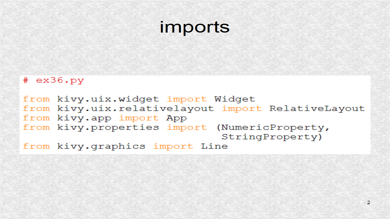
The root class is based on RelativeLayout, but there are Widgets for Toolbar and Drawing, as well as the 4 widgets which will be drawn. These four classes are shown in the next slide. We will use NumericProperty and StringProperty for our variables. Line is also imported, as we need to call some Line canvas instructions from inside this Python file.


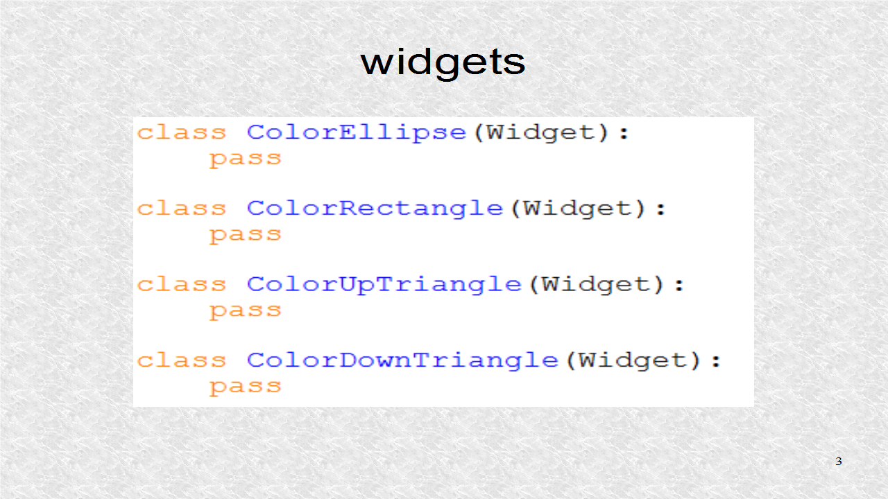
These are the 4 widgets which are drawn and dynamically added to the Drawing class. There shapes are defined in the Kivy language.


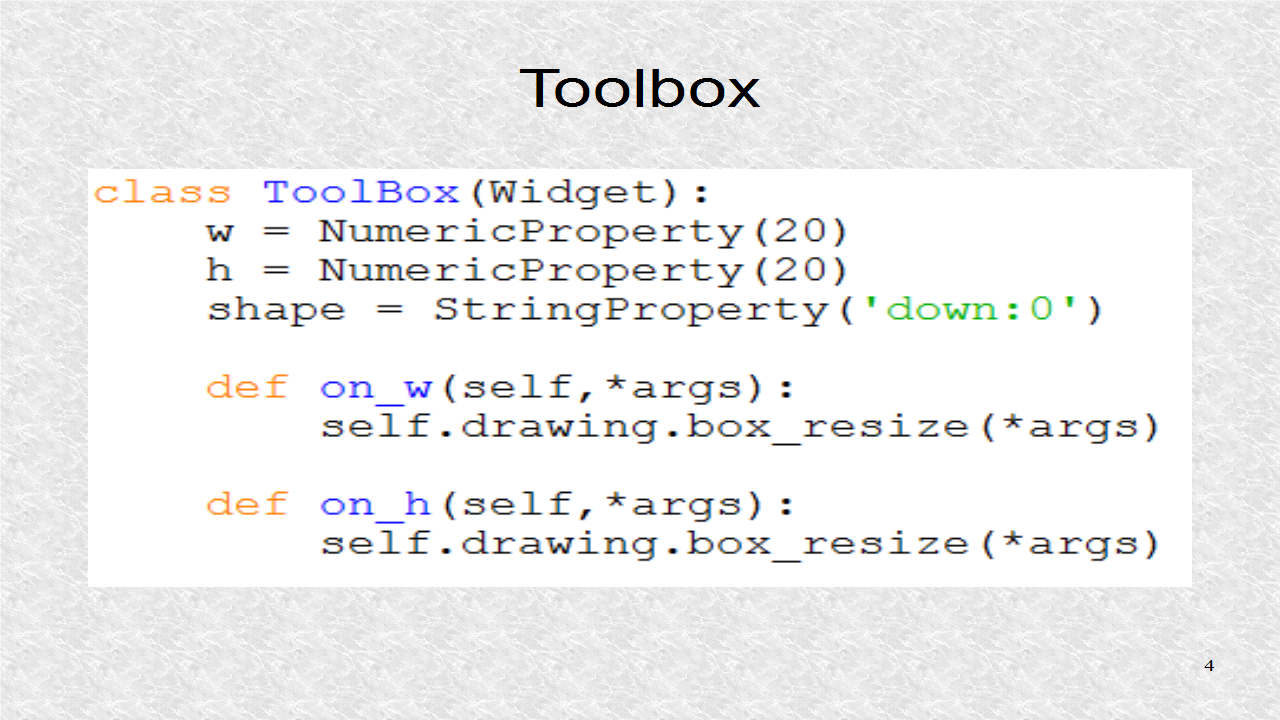
The Toolbox class uses most of the Kivy language kv file for instructions for Buttons, ToggleButtons and Labels. In the python file, it does only a few things. It defines 3 Properties. Two are for the width and height. Shape is a string which indicates the selected shape. The function on_w, and on_h, are called each time by Kivy whenever the width or height changes, according to user selection in the Toolbar. Whenever the width or height changes, we call a function to erase the box, should it exist. The box is created in the Drawing class.


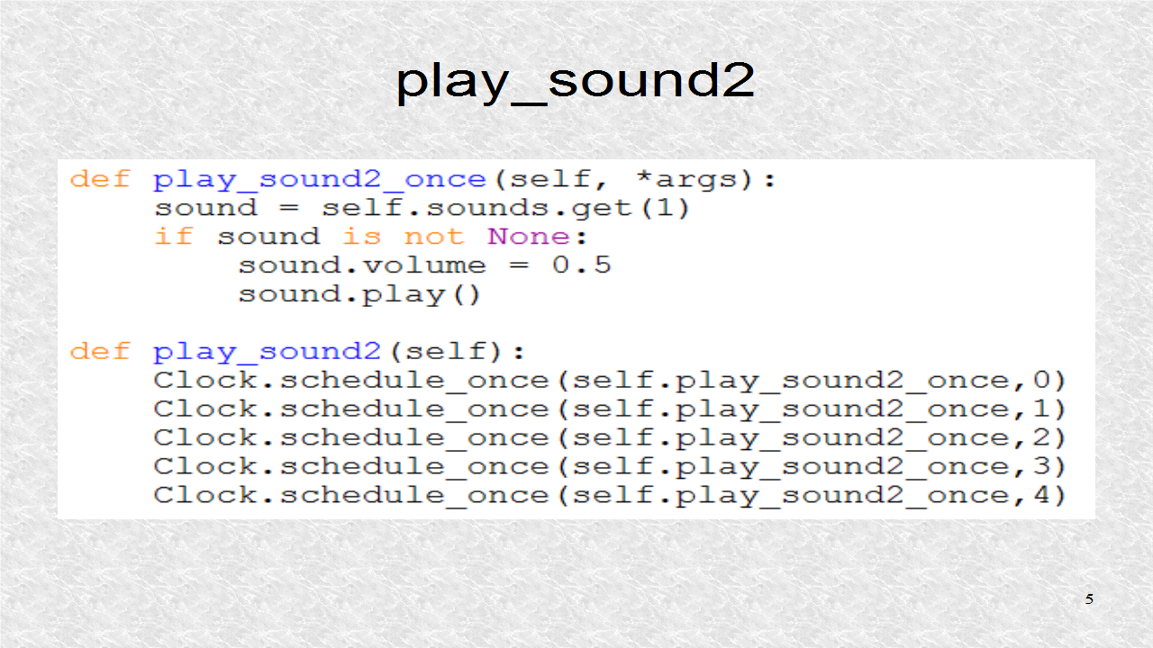
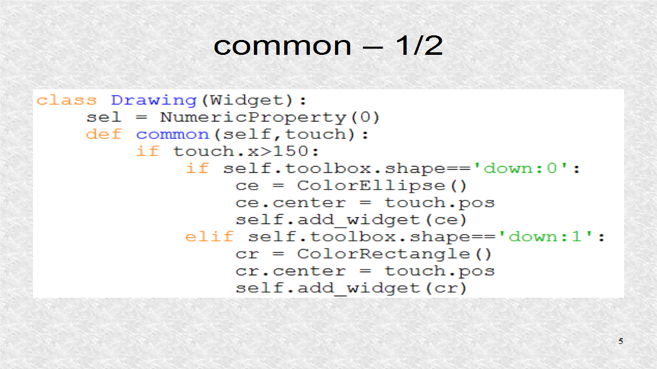
The Drawing class has to have a lot of code. It is responsible for adding instances of one of the 4 widgets. Besides that we have some functions, like Clear, Undo, and Box. The NumericProperty, sel, indicates if a box has been drawn around the current widget. We show, here, the first half of the function common. It sees if the user has selected one of the 4 shapes. The Drawing class then adds the corresponding widget with the add_widget function. The common function receives the touch argument, so it knows where to place the widget.


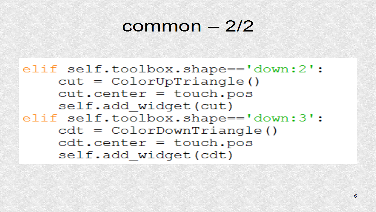
This is the second half of the common function. It adds one of the last two shapes depending on the value of shape property of the Toolbox class.


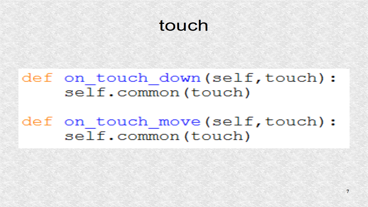
The function common is called from either on_touch_down or on touch move, which Kivy calls if it detects a click or drag. We also pass the touch parameter to the function common.


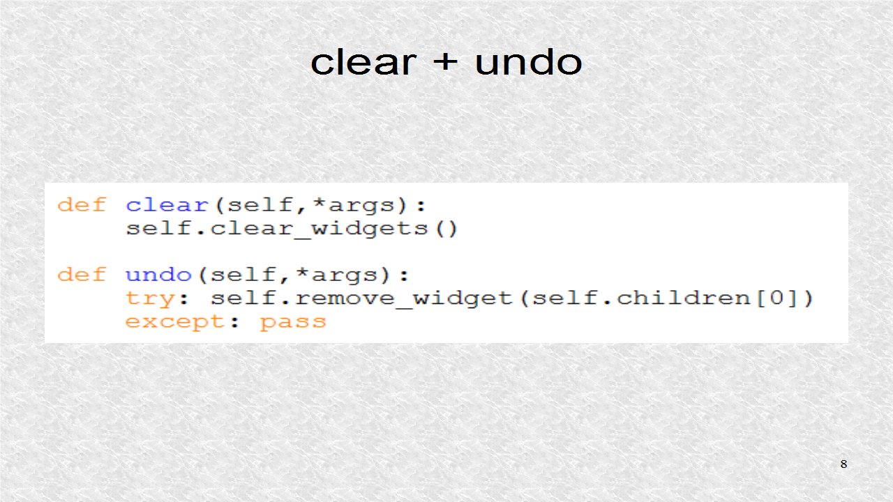
These functions are called from the Kivy kv file if the corresponding Button is pressed. The function clear will clear all the widgets in the Drawing class. Undo removes the last widget from the Drawing class. Notice the children function will get all the children widgets of the Drawing class. We only remove the top-most widget. There is a try clause, so we will not get an error should there be no widget. In that case, we ask it to do nothing.


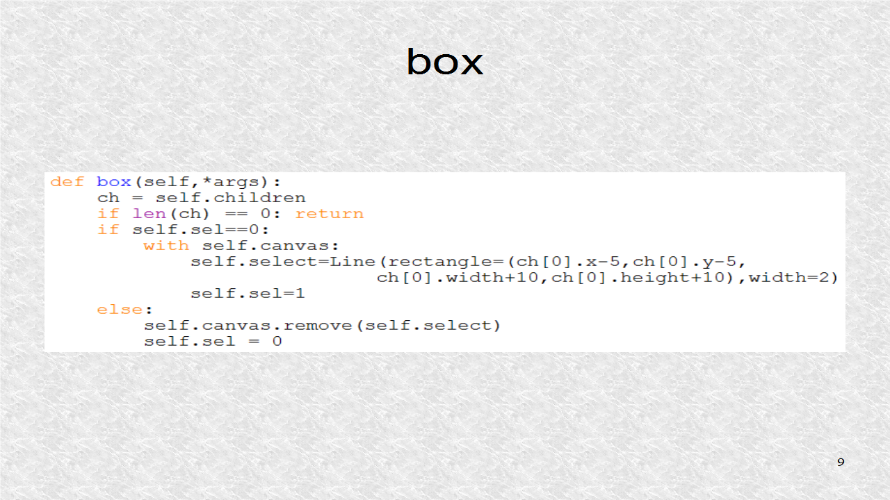
The box function is called when the last button in the Toolbar is pressed. The list of widget childs will be in the ch list. Should there be none, the function just exits. But if there are widgets, it sees if the sel property is 0 or 1. If sel is 0, a box is drawn around topmost widget, and then sel is set. If sel is set, and Box button is pressed, it will remove the rectangle, and clear sel, so a new box may be drawn.


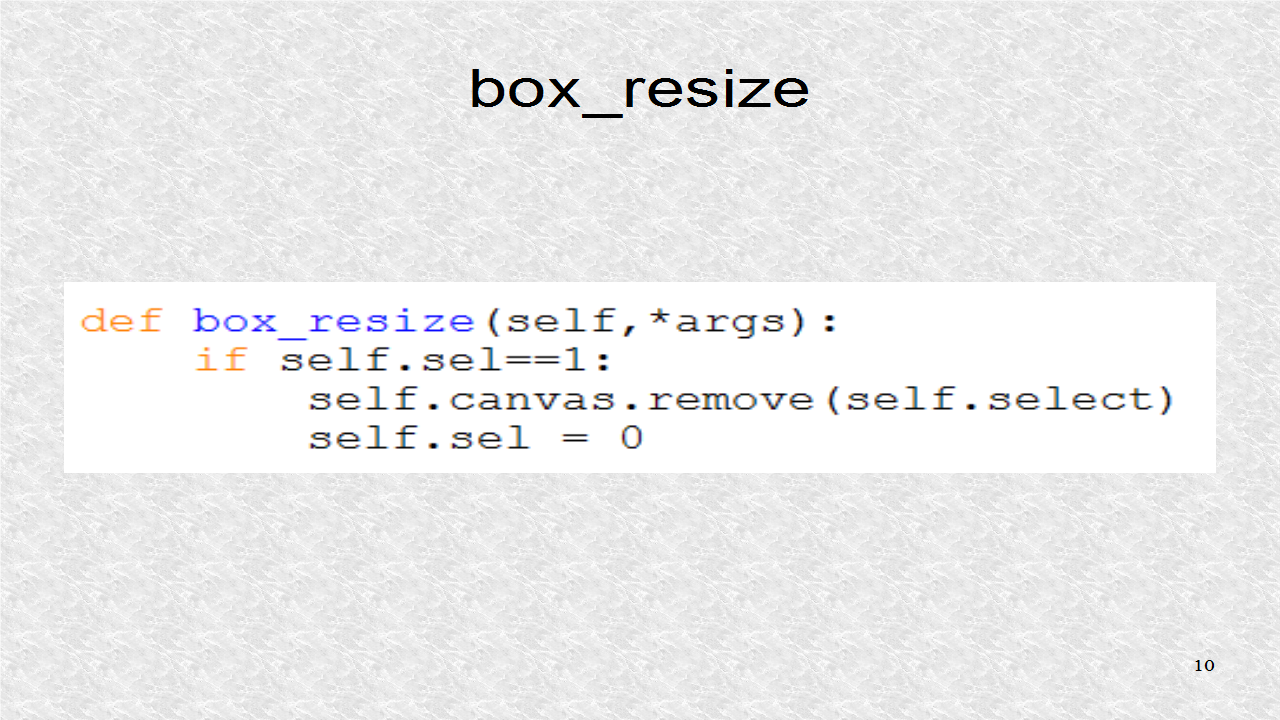
The box_resize function is called by on_w and on_h functions. It removes the box should it exist.


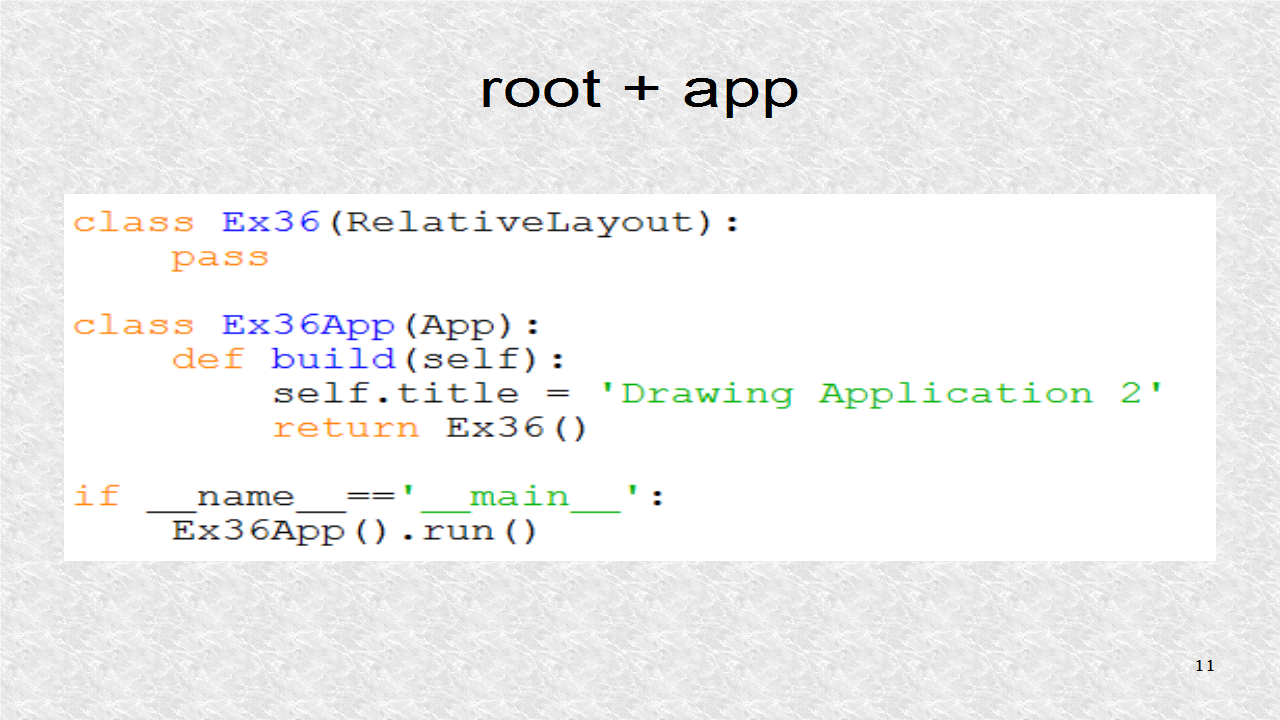
The root class is based on RelativeLayout. The application's title is 'Drawing Application 2'. This will be displayed on the window.


# ex36.py

from kivy.uix.widget import Widget
from kivy.uix.relativelayout import RelativeLayout
from kivy.app import App
from kivy.properties import (NumericProperty,
                             StringProperty)
from kivy.graphics import Line

class ColorEllipse(Widget):
    pass

class ColorRectangle(Widget):
    pass

class ColorUpTriangle(Widget):
    pass

class ColorDownTriangle(Widget):
    pass

class ToolBox(Widget):
    w = NumericProperty(20)
    h = NumericProperty(20)
    shape = StringProperty('down:0')

    def on_w(self,*args):
        self.drawing.box_resize(*args)

    def on_h(self,*args):
        self.drawing.box_resize(*args)
    
class Drawing(Widget):
    sel = NumericProperty(0)
    def common(self,touch):
        if touch.x>150:
            if self.toolbox.shape=='down:0':
                ce = ColorEllipse()
                ce.center = touch.pos
                self.add_widget(ce)
            elif self.toolbox.shape=='down:1':
                cr = ColorRectangle()
                cr.center = touch.pos
                self.add_widget(cr)
            elif self.toolbox.shape=='down:2':
                cut = ColorUpTriangle()
                cut.center = touch.pos
                self.add_widget(cut)
            elif self.toolbox.shape=='down:3':
                cdt = ColorDownTriangle()
                cdt.center = touch.pos
                self.add_widget(cdt)
        
    def on_touch_down(self,touch):
        self.common(touch)

    def on_touch_move(self,touch):
        self.common(touch)

    def clear(self,*args):
        self.clear_widgets()

    def undo(self,*args):
        try: self.remove_widget(self.children[0])
        except: pass

    def box(self,*args):
        ch = self.children
        if len(ch) == 0: return
        if self.sel==0:
            with self.canvas:
                self.select=Line(rectangle=(ch[0].x-5,ch[0].y-5,
                                ch[0].width+10,ch[0].height+10),width=2)
                self.sel=1
        else:
            self.canvas.remove(self.select)
            self.sel = 0

    def box_resize(self,*args):
        if self.sel==1:
            self.canvas.remove(self.select)
            self.sel = 0
       
class Ex36(RelativeLayout):
    pass
        
class Ex36App(App):
    def build(self):
        self.title = 'Drawing Application 2'
        return Ex36()

if __name__=='__main__':
    Ex36App().run()


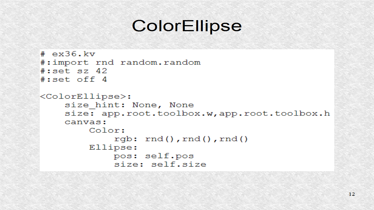
In the kv file, random() function is imported from the random module with alias of rnd. The random() function returns a number from 0 to 1. Next two variables are set, sz and off. The kv for the first Widget is added. It gets its size from the w and h properties.


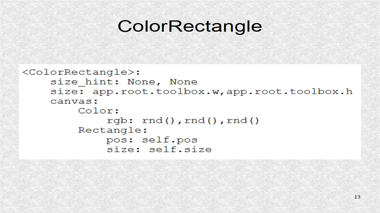
This is the kv for the second widget. It is similar to the first except it is based on the Rectangle canvas instruction.


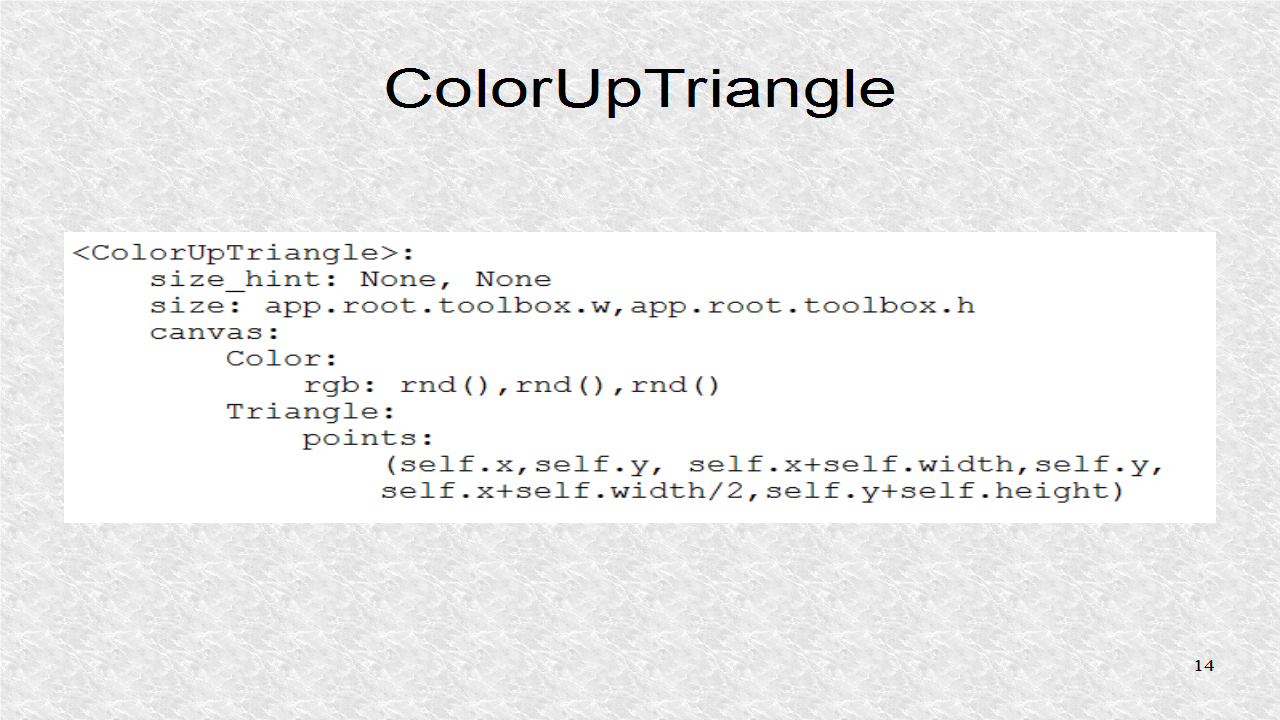
This widget draws a triangle which points upwards.


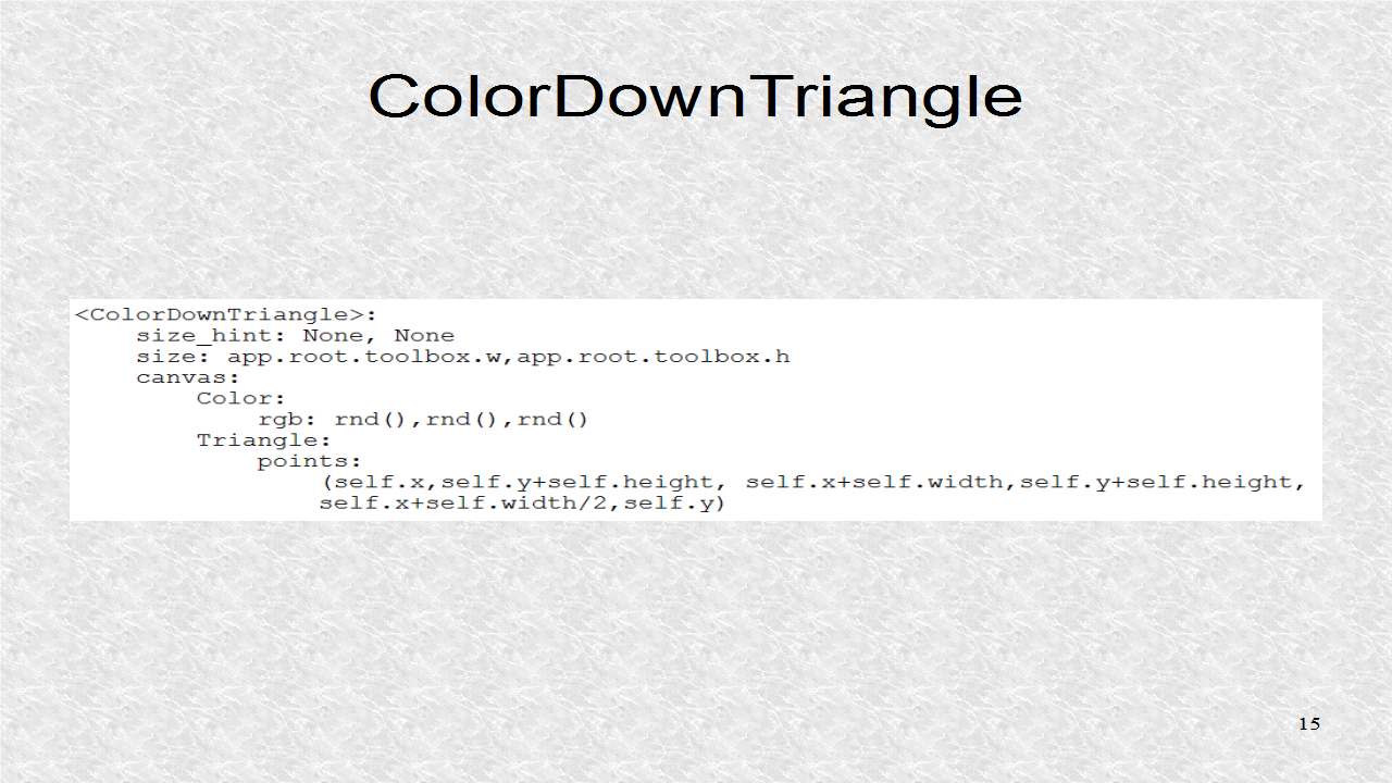
This widget draws a triangle which points downwards.


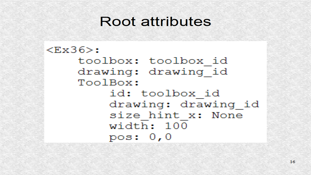
In the root class, attributes are created to point to ToolBox and Drawing class. The Toolbox id is set, and it creates it's own drawing attribute. We could have renamed it, if we had wanted, however that adds only confusion. The Toolbox will only use the first 100 pixels of the screen.


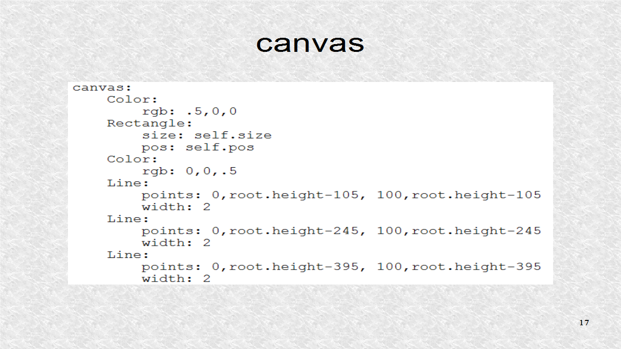
In the canvas instructions, we set the color as reddish, which is applied to the entire toolbox. Then three blue lines are drawn. These lines will delimit the width and height sections as we will see.


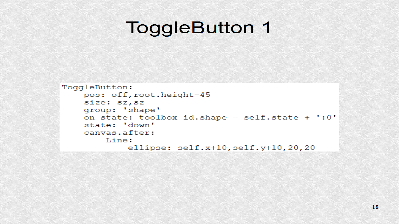
The first ToggleButton is drawn. It is the ellipse shape. Here, we can see how the shape string is created. The on_state is called whenever the state changes. The state is a string, it can be 'normal' or 'down'. We add a string ':0' to it. Thus, the two possible values are 'normal:0' or 'down:0'. We also set the initial state as 'down'. There are canvas.after instruction to draw over the ToggleButton.


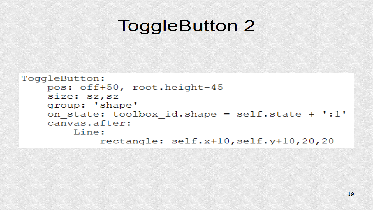
ToggleButton 2 is for the rectangle shape. Now the state variable is set as 'normal:1' or 'down:1', when the ToggleButton is pressed.


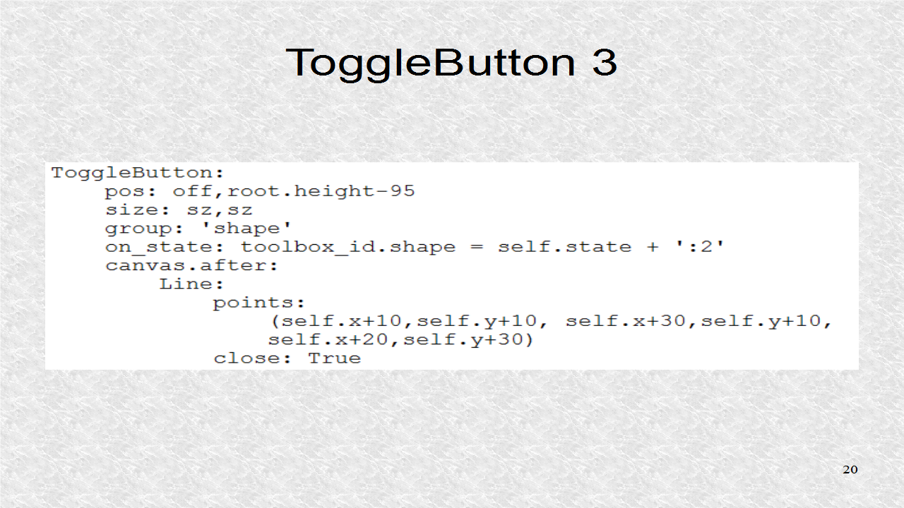
ToggleButton 3 is for the triangle up shape.


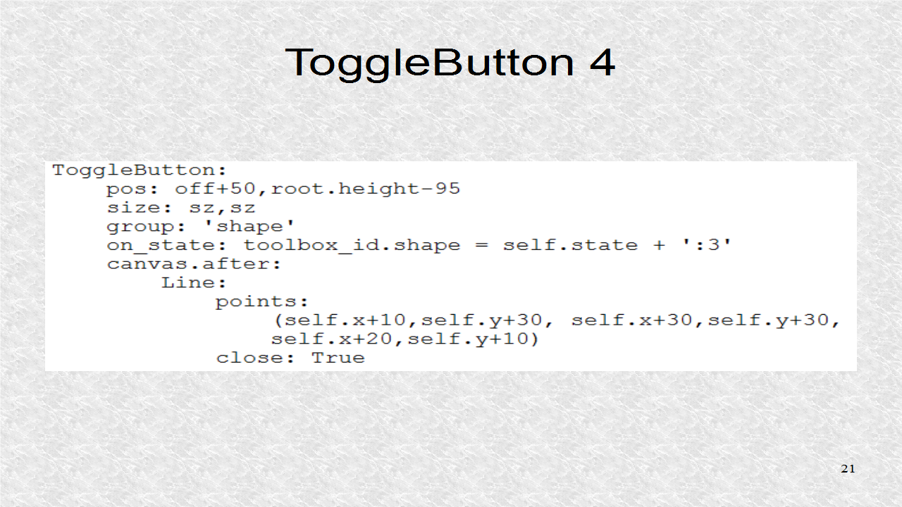
ToggleButton 4 is for the triangle down shape.


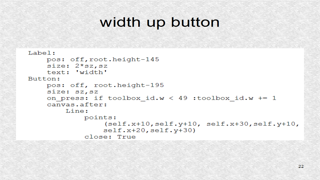
We have a label indicating this section deals with 'width'. There is an up button, which increments the w property.


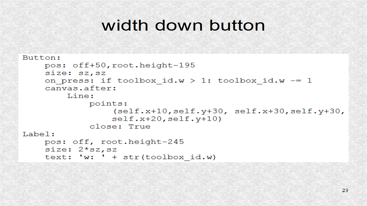
The down button decrements w, and finally the label indicates the current value of w .


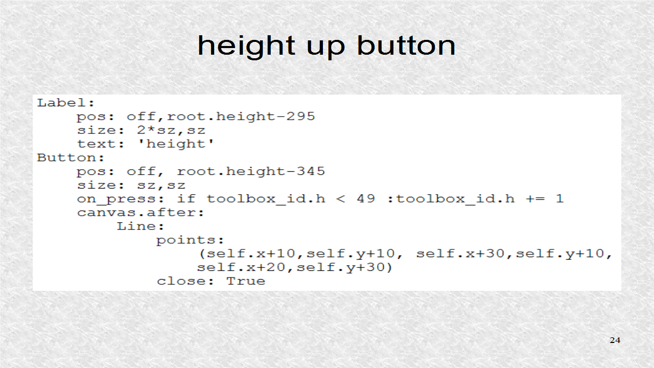
The Label indicates we are in the 'height' section. The up button increments the value of the h property.


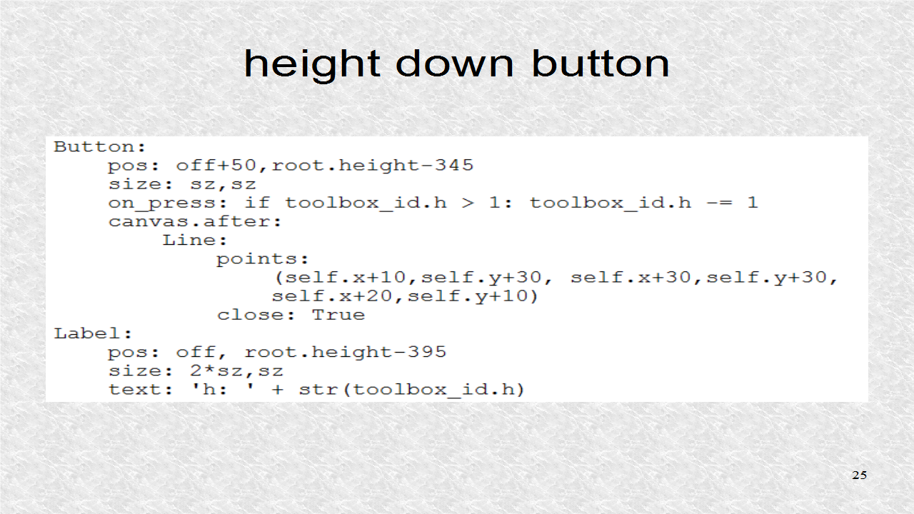
There is a button that when pressed, it will decrement the h property. Finally, the Label indicates the current value of the h property. Both w and h are bounded, between 1 and 49.


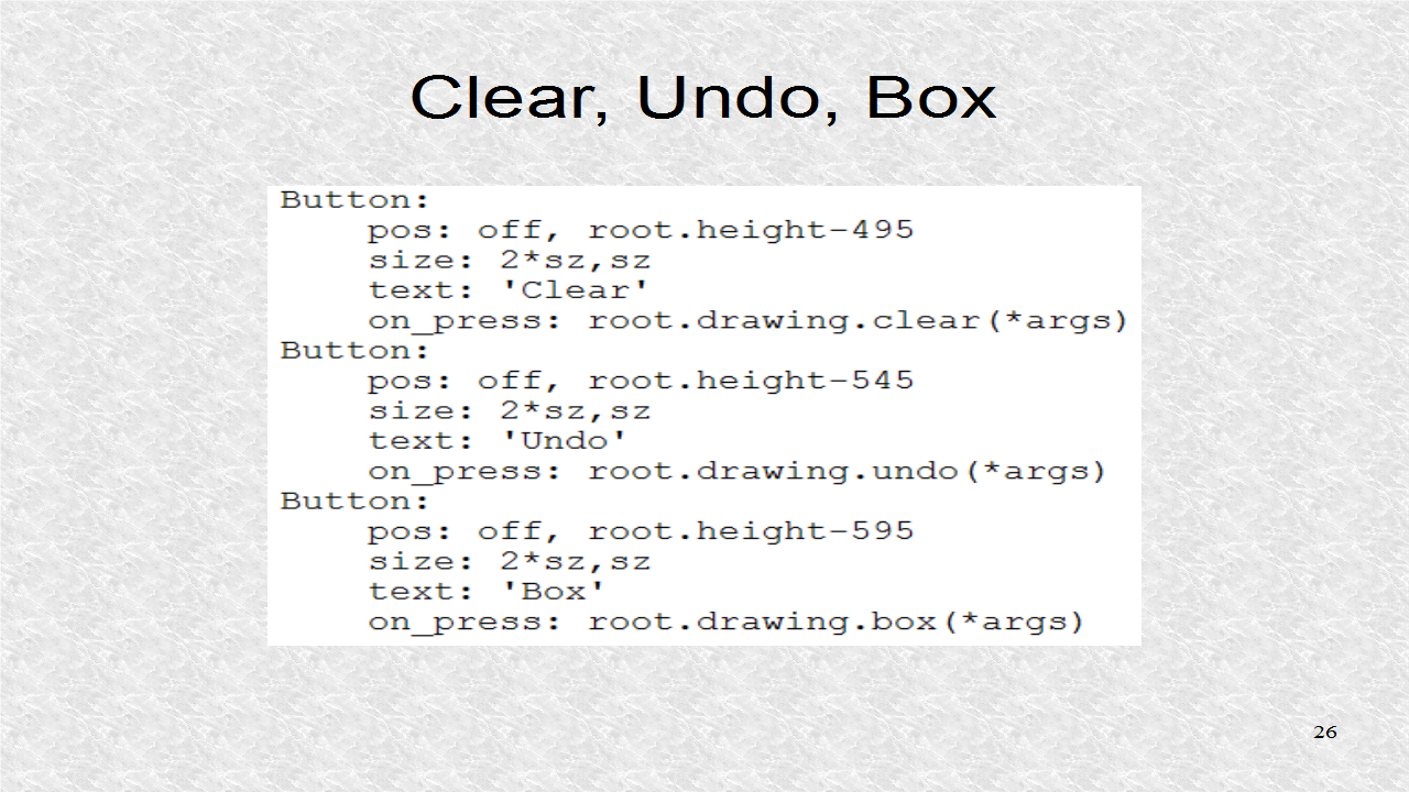
The buttons for 'Clear', 'Undo', and 'Box' are created and call the appropriate function in the Drawing class.


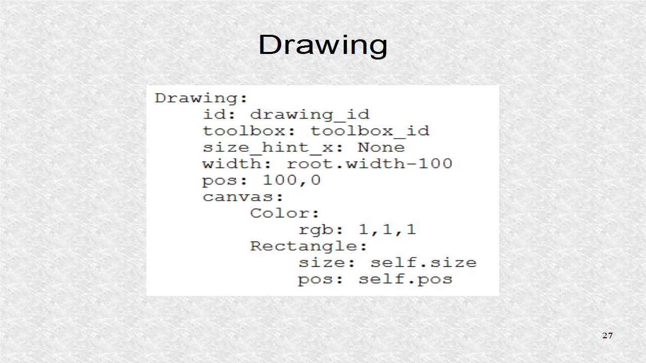
The Drawing class itself has very little kv code. It has the attribute toolbox. It is sized to fit the rest of screen, and is colored white.


# ex36.kv
#:import rnd random.random
#:set sz 42
#:set off 4

<ColorEllipse>:
    size_hint: None, None
    size: app.root.toolbox.w,app.root.toolbox.h
    canvas:
        Color:
            rgb: rnd(),rnd(),rnd()
        Ellipse:
            pos: self.pos
            size: self.size

<ColorRectangle>:
    size_hint: None, None
    size: app.root.toolbox.w,app.root.toolbox.h
    canvas:
        Color:
            rgb: rnd(),rnd(),rnd()
        Rectangle:
            pos: self.pos
            size: self.size

<ColorUpTriangle>:
    size_hint: None, None
    size: app.root.toolbox.w,app.root.toolbox.h
    canvas:
        Color:
            rgb: rnd(),rnd(),rnd()
        Triangle:
            points:
                (self.x,self.y, self.x+self.width,self.y,
                self.x+self.width/2,self.y+self.height)

<ColorDownTriangle>:
    size_hint: None, None
    size: app.root.toolbox.w,app.root.toolbox.h
    canvas:
        Color:
            rgb: rnd(),rnd(),rnd()
        Triangle:
            points:
                (self.x,self.y+self.height,
                self.x+self.width,self.y+self.height,
                self.x+self.width/2,self.y)

            
<Ex36>:
    toolbox: toolbox_id
    drawing: drawing_id
    ToolBox:
        id: toolbox_id
        drawing: drawing_id
        size_hint_x: None
        width: 100
        pos: 0,0
        canvas:
            Color:
                rgb: .5,0,0
            Rectangle:
                size: self.size
                pos: self.pos
            Color:
                rgb: 0,0,.5
            Line:
                points: 0,root.height-105, 100,root.height-105
                width: 2
            Line:
                points: 0,root.height-245, 100,root.height-245
                width: 2
            Line:
                points: 0,root.height-395, 100,root.height-395
                width: 2
        ToggleButton:
            pos: off,root.height-45
            size: sz,sz
            group: 'shape'
            on_state: toolbox_id.shape = self.state + ':0'
            state: 'down'
            canvas.after:
                Line:
                    ellipse: self.x+10,self.y+10,20,20
        ToggleButton:
            pos: off+50, root.height-45
            size: sz,sz
            group: 'shape'
            on_state: toolbox_id.shape = self.state + ':1'
            canvas.after:
                Line:
                    rectangle: self.x+10,self.y+10,20,20
        ToggleButton:
            pos: off,root.height-95
            size: sz,sz
            group: 'shape'
            on_state: toolbox_id.shape = self.state + ':2'
            canvas.after:
                Line:
                    points:
                        (self.x+10,self.y+10, self.x+30,self.y+10,
                        self.x+20,self.y+30)
                    close: True
        ToggleButton:
            pos: off+50,root.height-95
            size: sz,sz
            group: 'shape'
            on_state: toolbox_id.shape = self.state + ':3'
            canvas.after:
                Line:
                    points:
                        (self.x+10,self.y+30, self.x+30,self.y+30,
                        self.x+20,self.y+10)
                    close: True
        Label:
            pos: off,root.height-145
            size: 2*sz,sz
            text: 'width'
        Button:
            pos: off, root.height-195
            size: sz,sz
            on_press: if toolbox_id.w < 49 :toolbox_id.w += 1
            canvas.after:
                Line:
                    points:
                        (self.x+10,self.y+10, self.x+30,self.y+10,
                        self.x+20,self.y+30)
                    close: True
        Button:
            pos: off+50,root.height-195
            size: sz,sz
            on_press: if toolbox_id.w > 1: toolbox_id.w -= 1
            canvas.after:
                Line:
                    points:
                        (self.x+10,self.y+30, self.x+30,self.y+30,
                        self.x+20,self.y+10)
                    close: True
        Label:
            pos: off, root.height-245
            size: 2*sz,sz
            text: 'w: ' + str(toolbox_id.w)

        Label:
            pos: off,root.height-295
            size: 2*sz,sz
            text: 'height'
        Button:
            pos: off, root.height-345
            size: sz,sz
            on_press: if toolbox_id.h < 49 :toolbox_id.h += 1
            canvas.after:
                Line:
                    points:
                        (self.x+10,self.y+10, self.x+30,self.y+10,
                        self.x+20,self.y+30)
                    close: True
        Button:
            pos: off+50,root.height-345
            size: sz,sz
            on_press: if toolbox_id.h > 1: toolbox_id.h -= 1
            canvas.after:
                Line:
                    points:
                        (self.x+10,self.y+30, self.x+30,self.y+30,
                        self.x+20,self.y+10)
                    close: True
        Label:
            pos: off, root.height-395
            size: 2*sz,sz
            text: 'h: ' + str(toolbox_id.h)
        Button:
            pos: off, root.height-495
            size: 2*sz,sz
            text: 'Clear'
            on_press: root.drawing.clear(*args)
        Button:
            pos: off, root.height-545
            size: 2*sz,sz
            text: 'Undo'
            on_press: root.drawing.undo(*args)
        Button:
            pos: off, root.height-595
            size: 2*sz,sz
            text: 'Box'
            on_press: root.drawing.box(*args)
            
            
    Drawing:
        id: drawing_id
        toolbox: toolbox_id
        size_hint_x: None
        width: root.width-100
        pos: 100,0
        canvas:
            Color:
                rgb: 1,1,1
            Rectangle:
                size: self.size
                pos: self.pos


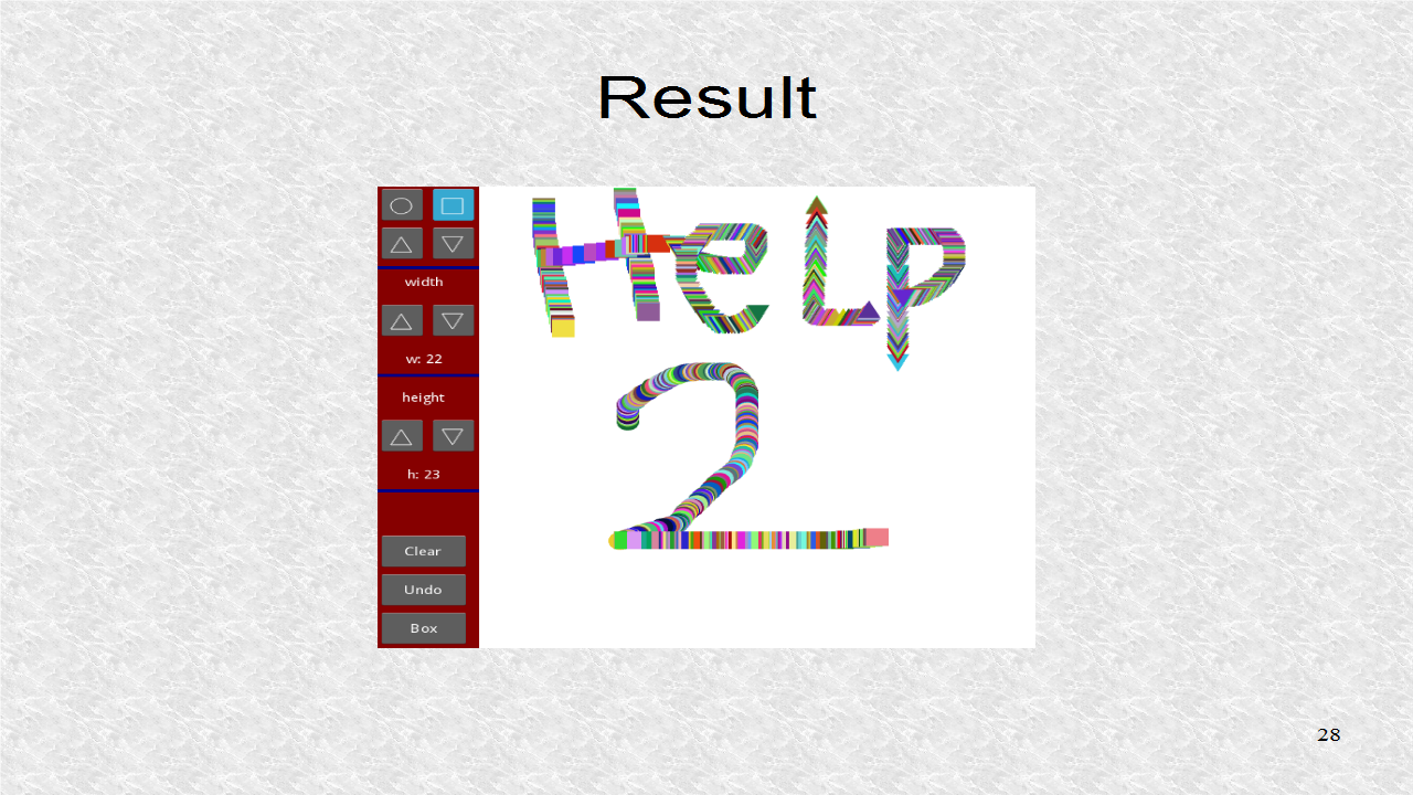
This is one result of running the program. A separate video goes over the usage in detail. Because w and h are properties, any change in their values will update all the child widgets. Should we not want this behavior, we will have to make them regular variables.


Demo of App on Youtube.